
E-commerce experience refresh and design system for CUUP, modern underwear brand
Lorem ipsum dolor sit amet, consectetur adipiscing elit. Suspendisse tincidunt sagittis eros. Quisque quis euismod lorem. Etiam sodales ac felis id interdum.
Lorem ipsum dolor sit amet, consectetur adipiscing elit. Suspendisse tincidunt sagittis eros. Quisque quis euismod lorem. Etiam sodales ac felis id interdum.
Support the launch of CUUP's Swim Line by designing the UI that seamlessly weaves commerce with engaging editorial content and inspires its customers. Create a Design System to support the future growth.


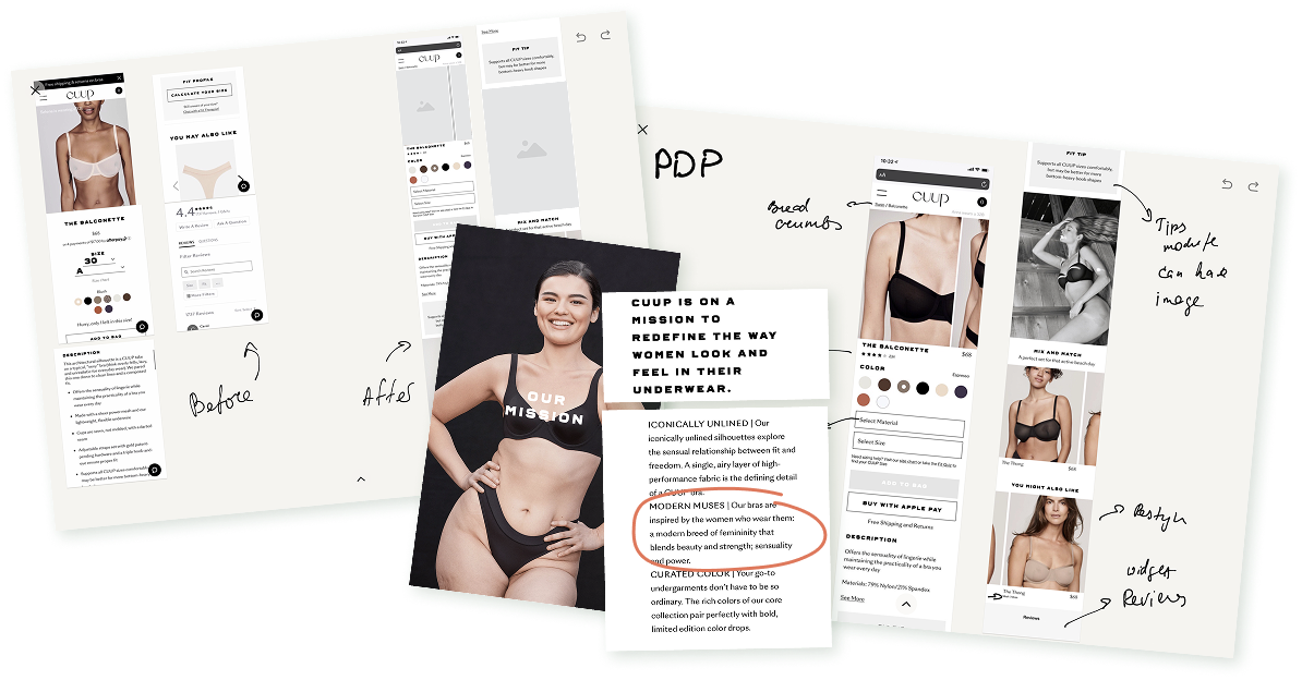
I’ve started with the Audit of the current CUUP website, discovering, establishing and stress-testing a style and library of components and patterns.
Understanding of the qualities and elemts helped me to gauge how much of undertaking this process might be and how it will work together with the elements that will not be updated.
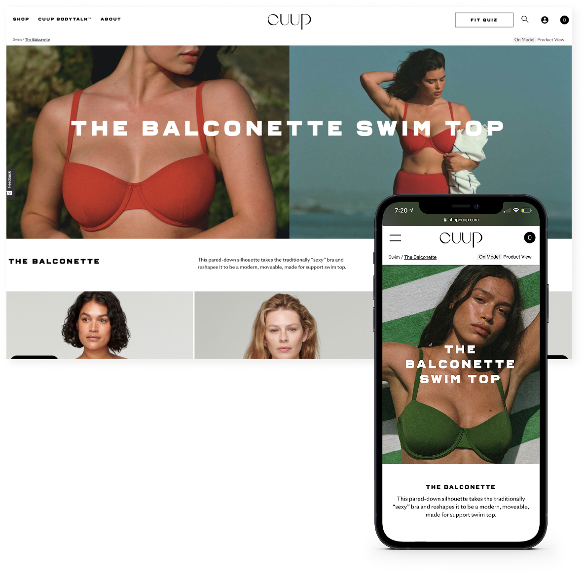
CUUP’s design philosophy is rooted in everyday reverence for every woman’s body. CUUP curates color through an artistic lens, elevating the bra from a utilitarian basic to an expressive foundation.
I used Golden Ratio-based proportions and sleek typography to communicate these values through UI.


Each page was designed to bring a new degree of focus and magnitude to the beautiful products, materials, and textures. Editorial content was integrated into the grid for customers to experience the swim line.

The design system was meant to streamline design workflows, make start-to-end deliverable times faster, to standardize the usage of reusable components and font styles, and to implement standard base spacing units, font hierarchy increments, and more into the design team’s workflows.

